A few months ago, we invited you to meet Pega to tell you who we are and why we’re different. And even though we’ve been in business longer than I’ve been alive, people still wonder what we’re all about. Who is Pega? What do we stand for as a brand? Why do you have a flying horse on your shirt? As Pega’s Associate Creative Director for Design, I think I can explain it best by showing you how our brand has evolved … and is still evolving.
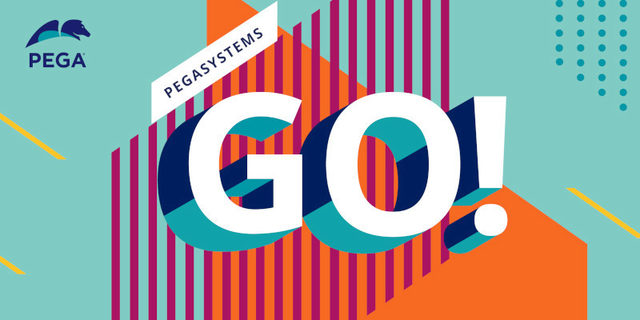
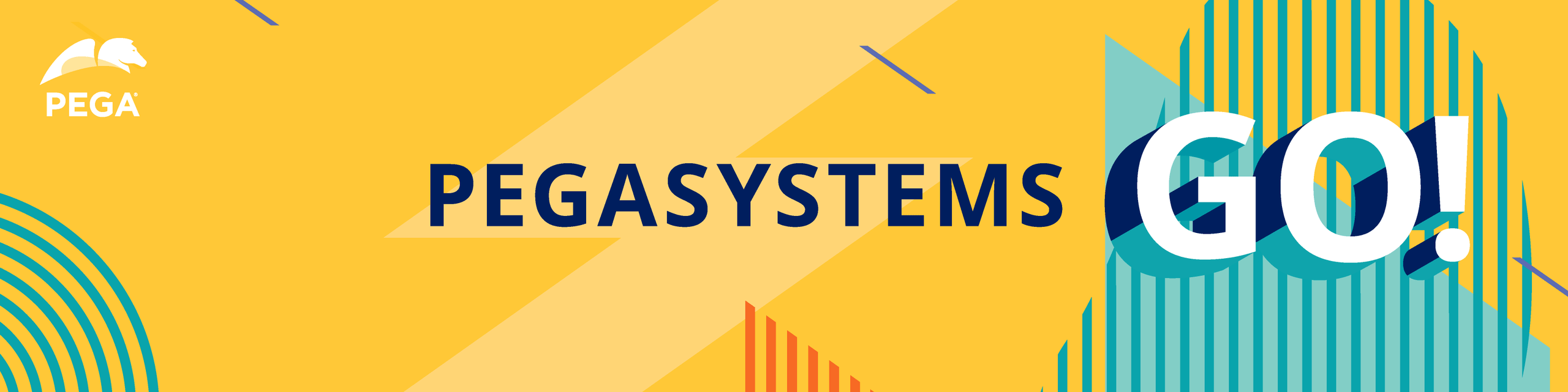
The video is from our new Pegasystems GO! campaign. It’s bold, colorful, modern, and engaging. And it’s a complete 180 from where our branding started.
Building Pega’s brand story: Rethinking what we look and sound like
Our journey and values are what makes our brand unique, though, to be perfectly honest with you, that wasn’t always clear to us. Trying to figure out who you are and what you stand for is a (very) tall order. This is because we weren’t always talking about it, and when we did try to talk about it, we weren’t consistent in our delivery. Confusing? Um, yes. But that’s all changing, starting right now.
I can assure you that connecting all the dots to tell a cohesive, engaging, and dynamic brand story takes a lot (I repeat, a lot) of time, effort, and thought from a lot of people. And, believe it or not, design is more than just picking out colors, shapes, images, and text, throwing it all together and calling it a day. On the surface it all seems pretty straightforward, but you’re actually only seeing the tip of the iceberg. Beneath the arctic, frigid waters is a massive chunk of ice made of strategy, psychology, theory, and just a little glacial sprinkling of creative magic (a.k.a., Photoshop).
*Cue upbeat movie montage of creative brainstorming*
I’ve been at Pega for almost seven years now, and our brand has certainly been through, as the youths say, a “glow up.” When I arrived here in 2014 as a Senior Graphic Designer, Pega didn’t have much of a brand identity. We had a logo and some basic templated pieces of collateral that were all different. Nothing had been approached holistically and strategically. An eBook looked completely different than a whitepaper, which didn’t family in well with our in-person event experiences, and all of this certainly didn’t align visually with pega.com. It also wasn’t very modern or engaging. We were wrangling wildly different voices and varying writing styles through a single brand, and everything was just completely disjointed, visually. I call this: The Fractal Prison Era. (Those who know, know!)

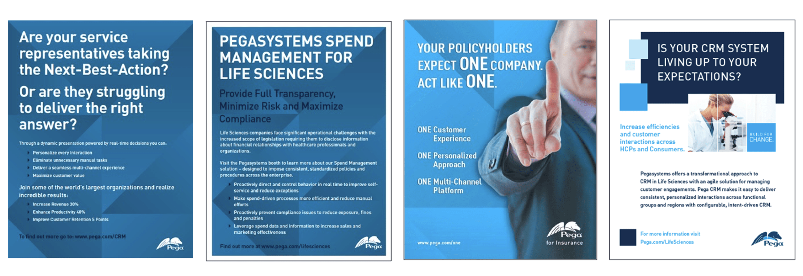
For a company whose foundational product is an industry-leading, unified platform, our brand aesthetic conveyed anything but unity or market leadership. It also looked like every other tech company from the early 2000s, which was unfortunate because we’ve never been like any other tech company! Our software is configurable, adaptable, scalable, and streamlines experiences from end to end, start to finish. It’s a truly unique value proposition in our industry. Also, we’re way cooler than just different shades of blue.
We realized we needed to tell our story better – with more authentic language and a brand that spoke to how innovative (and not boring!) we are.
The shape of things to come: Reenergizing the brand and getting real
We began speaking with a voice that is candid and authentic – reflecting the genuine conversations we were having day after day in client boardrooms around the globe. More real. Less rambling, academic, jargon-laden manifestoes. As my colleague and Pega’s Associate Creative Director for Copy, Anna Kramer, describes it: “Instead of echoing everyone else, we began creating our own conversation about who we are … We started taking an actual stand on what our brand does and is.”
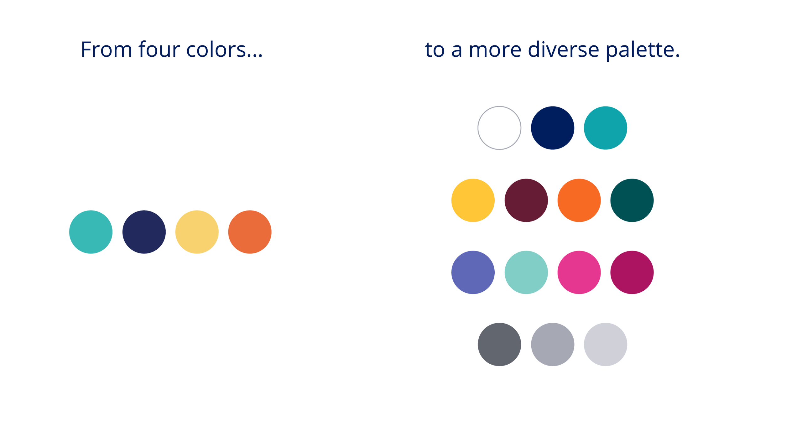
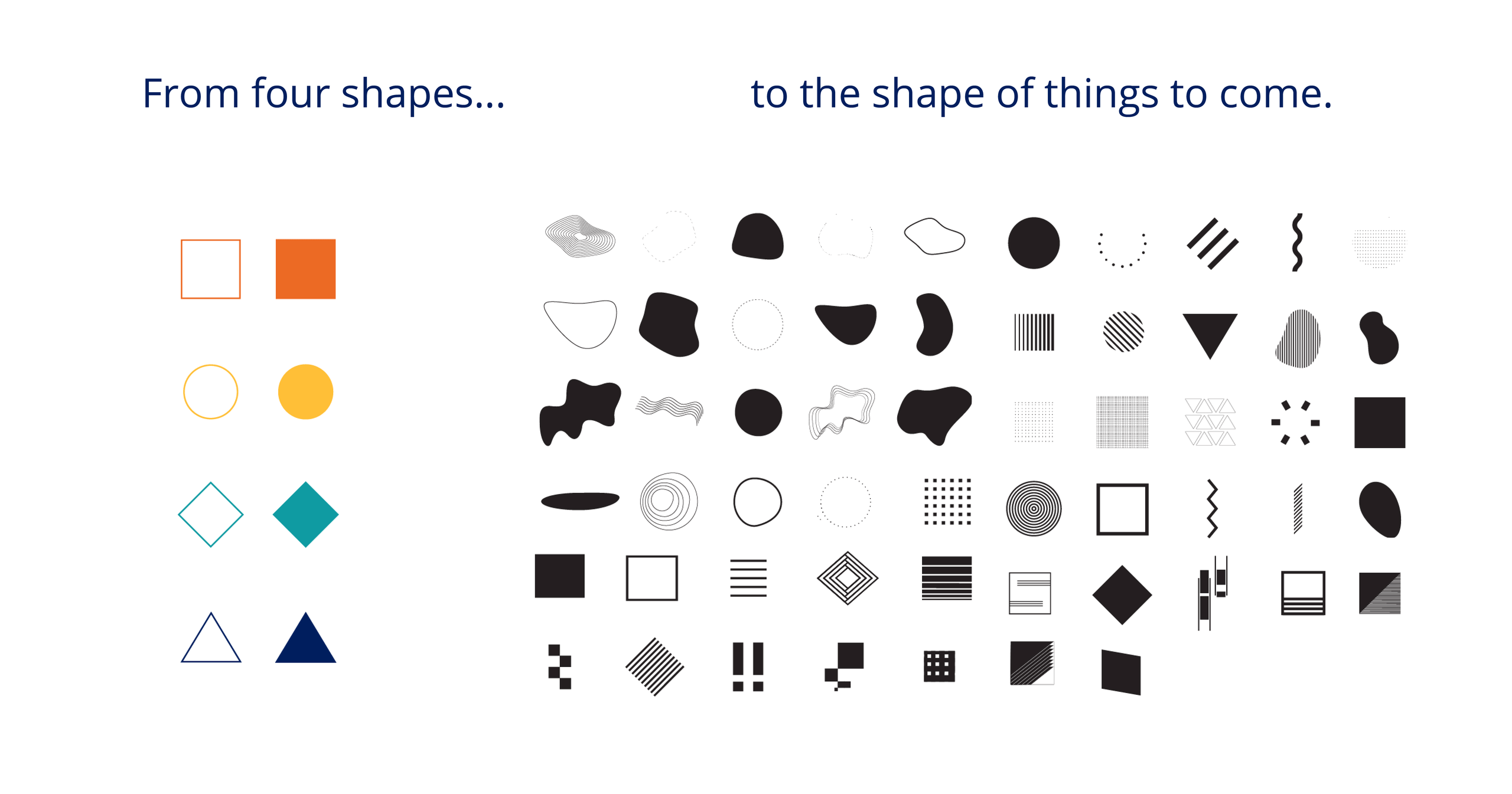
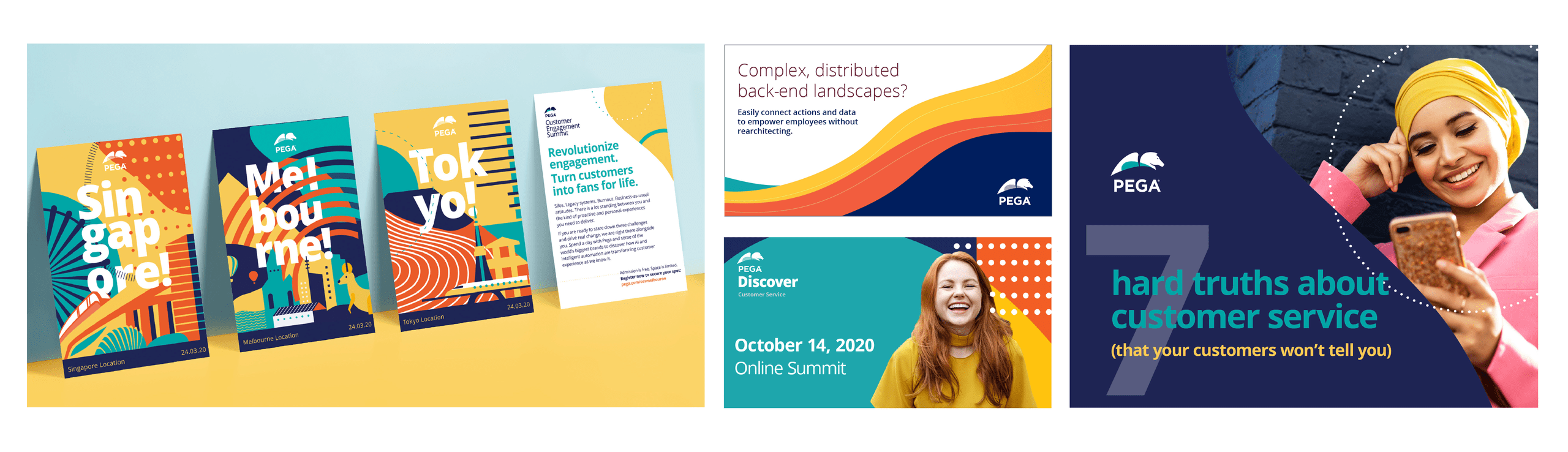
This also inspired a major evolution for the brand visual system, which until last year was anchored by four colors and a set of four geometric shapes. The shapes were rigid, inflexible, and impersonal – the very antithesis of our technology, which is infinitely pliable and built around a spirit of empathy and human understanding. The color palette was distinctive, to be sure, but again, it was very limiting without any degree of subtly. Taken together, our visuals felt stiff and corporate, not like the modern, innovation machine that is truly Pega.
Finally, we wanted to make sure we had an illustration style that was bold and differentiated and gave us even more flexibility to tell rich narrative stories about the outcomes our technology can deliver for our clients and their customers. We developed a series of conceptual scenes, a library of narrative illustrations, and a modular system of people – think: a set of faces, expressions, hair, legs, torsos that we could mix and match as needed.

The result is a system that feels true to Pega’s brand heritage but has continued to evolve into something more modern and customizable. This approach is something that can suit a variety of needs ranging from the web to events to social. And it will help shift Pega’s perception from old to modern, stodgy to cool, from outdated to innovative.
Where do we GO! From here?
Who we are is defined by our decades-long journey that began in 1983. Everything we’ve developed, learned, and experienced has defined us. We are the services, experiences, and stories shared across industries and around the world. We think deeply about every interaction and experience with our clients, customers, and partners. Our values (trust, inclusivity, innovation, to name a few…) come to life not just in what we say and do, but also in how we share them through our uniquely creative and visual perspective.
After 38 years of partnering with the largest companies in the world, we know that business complexity is the enemy of success. So, we developed our GO! campaign about cutting through that complexity with the power of Pega – and doing things you never thought possible.
GO! isn’t a command. It’s a rallying cry. A sense of possibility, bringing us together to seize this moment. According to Carlos Perez, Pega’s Creative Director, it’s exactly why your business needs to GO!
“The GO! Campaign is about moving forward, going after possibility, and seizing the moment. It comes at a time when organizations around the world are just ready to move on. We want our clients to focus on what matters most to them: building, creating, innovating, and imagining, while we handle the nitty-gritty complicated stuff that gets in their way.”
This is an exciting time for Pega. We have been in the tech space for more than three decades, and we have stayed relevant through the years by continuing to reinvent ourselves. Our GO! campaign marks the beginning of a new chapter for our brand. We are passionate about what we do, and we want our passion to be palpable – to get folks excited about building agility into their organizations.
If you’re ready to get work done, get results, and get ready for what comes next, connect with us! Watch a demo, start a free trial, or start a conversation. Let us help you bring your ideas to life.